Travel Product Add-ons
Travel Product Add-ons
Travel Product Add-ons
Travel Product Add-ons
Rolled-out 2 new travel product add-ons, driving a 15% increase in profits per purchase
Rolled-out 2 new travel product add-ons, driving a 15% increase in profits per purchase
Rolled-out 2 new travel product add-ons, driving a 15% increase in profits per purchase
Rolled-out 2 new travel product add-ons, driving a 15% increase in profits per purchase


Role
Role
Role
Product UX/UI Designer
Product UX/UI Designer
Product UX/UI Designer
Product UX/UI Designer
Tools
Tools
Tools
Figma, FigJam and Notion
Figma, FigJam and Notion
Figma, FigJam and Notion
Figma, FigJam and Notion
Contributors
Contributors
Contributors
1 Product Manager, 2 Developers, and 1 Designer (Me)
1 Product Manager, 2 Developers, and 1 Designer (Me)
1 Product Manager, 2 Developers, and 1 Designer (Me)
1 Product Manager, 2 Developers, and 1 Designer (Me)
Challenge
Our users faced significant inconvenience when trying to purchase essential travel add-ons such as seats and baggage because StudentUniverse lacked an integrated solution. This process introduced unnecessary complexities, forcing users to search for these items from various sources.
Results
The new add-on features make it easier for users to navigate and access essential travel features. The addition of seats and baggage options offered customization, thus enhancing user engagement, leading to a 15% increase in profits per purchase.
65%
65%
65%
65%
Increase in user interaction
Increase in user interaction
Increase in user interaction
Increase in user interaction
37%
37%
37%
37%
Added add-ons to cart
Added add-ons to cart
Added add-ons to cart
Added add-ons to cart
15%
15%
15%
15%
Increase in profit/purchase
Increase in profit/purchase
Increase in profit/purchase
Increase in profit/purchase
Context
Context
Context
Context
StudentUniverse is an agile startup specializing in helping students and young adults book affordable flights. While interning as a product UX/UI intern with the product team at StudentUniverse, along with my teammates, I had the opportunity to focus on enhancing the product add-ons section.
In this case study, we'll delve into the process I followed to enhance the user experience and drive significant business outcomes.
THE PROBLEM
THE PROBLEM
Users had to explore alternatives to purchase essential travel add-ons
Users had to explore alternatives to purchase essential travel add-ons
Users had to explore alternatives to purchase essential travel add-ons
Users had to explore alternatives to purchase essential travel add-ons
This experience resulted in:
• Users having to go through additional steps, making the booking process less seamless.
• Potential loss of customers who were looking for a more straightforward purchasing experience.
• Lack of add-on purchases on the website resulted in missed revenue opportunities for the business.
APPROACH
APPROACH
A quick look at our competitors showed that our product was falling behind..
A quick look at our competitors showed that our product was falling behind..
A quick look at our competitors showed that our product was falling behind..
A quick look at our competitors showed that our product was falling behind..
To gain insight into our product's standing, I conducted an in-depth analysis of the competition and explored their platforms. It became evident that our product was lagging behind. We observed that many third-party travel agent websites already offered add-on perks, prompting us to focus on a targeted competitive analysis.
To gain insight into our product's standing, I conducted an in-depth analysis of the competition and explored their platforms. It became evident that our product was lagging behind. We observed that many third-party travel agent websites already offered add-on perks, prompting us to focus on a targeted competitive analysis.
To gain insight into our product's standing, I conducted an in-depth analysis of the competition and explored their platforms. It became evident that our product was lagging behind. We observed that many third-party travel agent websites already offered add-on perks, prompting us to focus on a targeted competitive analysis.
To gain insight into our product's standing, I conducted an in-depth analysis of the competition and explored their platforms. It became evident that our product was lagging behind. We observed that many third-party travel agent websites already offered add-on perks, prompting us to focus on a targeted competitive analysis.
So we targeted competitive analysis primarily to see
So we targeted competitive analysis primarily to see
So we targeted competitive analysis primarily to see
So we targeted competitive analysis primarily to see
features and benefits that they offer
understanding of their pricing strategy
customer experiences
Kayak, Expedia, Booking[.com], Trip[.com], Kiwi[.com] were the main competitors
features and benefits that they offer
understanding of their pricing strategy
customer experiences
Kayak, Expedia, Booking[.com], Trip[.com], Kiwi[.com] were the main competitors
features and benefits that they offer
understanding of their pricing strategy
customer experiences
Kayak, Expedia, Booking[.com], Trip[.com], Kiwi[.com] were the main competitors
features and benefits that they offer
understanding of their pricing strategy
customer experiences
Kayak, Expedia, Booking[.com], Trip[.com], Kiwi[.com] were the main competitors
LEARNINGS
LEARNINGS
Key insights discovered from the research were:
Key insights discovered from the research were:
Key insights discovered from the research were:
Key insights discovered from the research were:
Hierarchy/navigation
Hierarchy/navigation
Hierarchy/navigation
Baggage and seat add-ons were consistently placed after the traveler and contact information sections during the itinerary checkout process
Baggage and seat add-ons were consistently placed after the traveler and contact information sections during the itinerary checkout process
Baggage and seat add-ons were consistently placed after the traveler and contact information sections during the itinerary checkout process
Baggage and seat add-ons were consistently placed after the traveler and contact information sections during the itinerary checkout process
Add-ons design
Add-ons design
Add-ons design
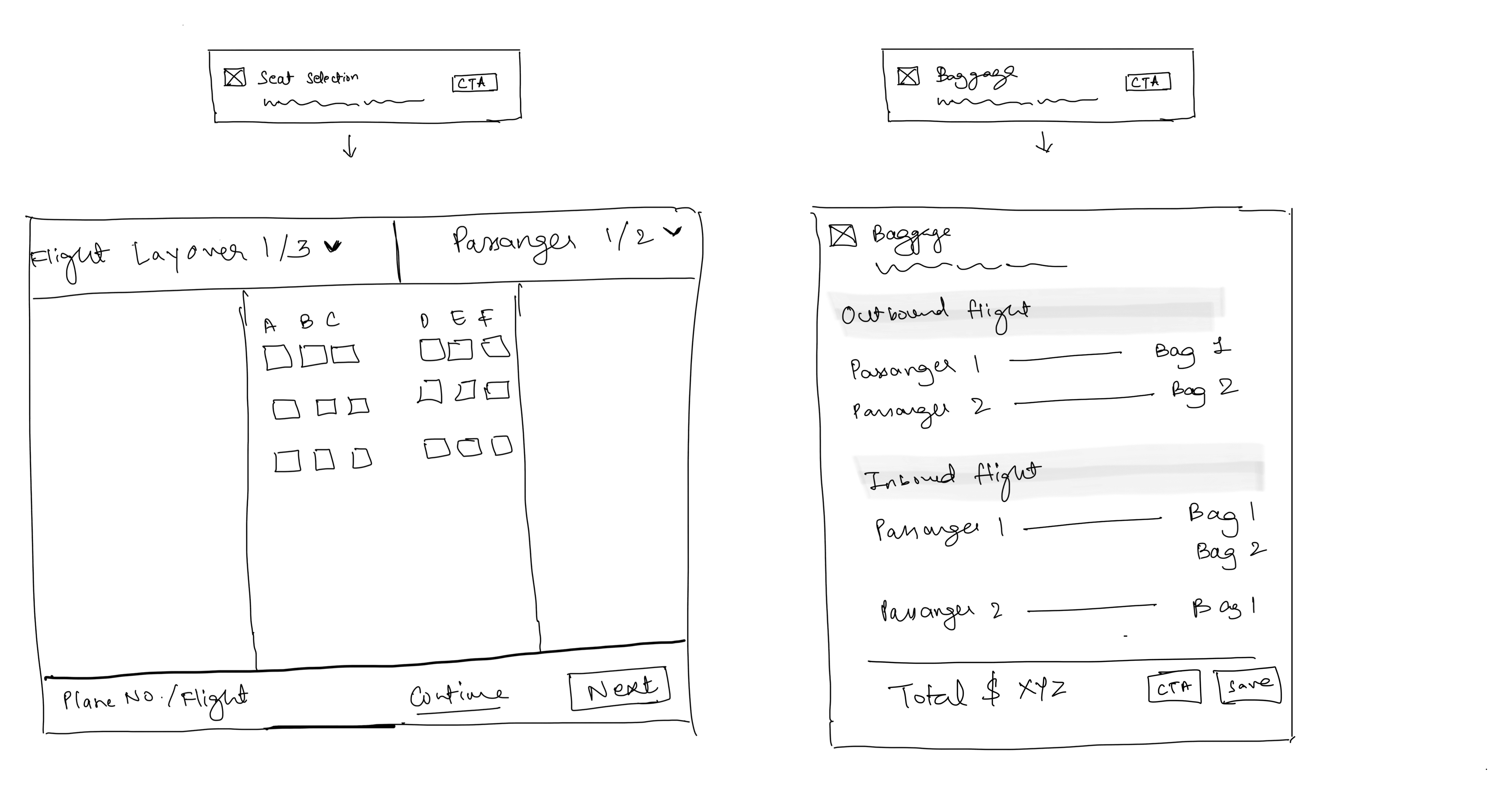
Baggage design: Baggage options were divided into outbound and inbound sections on the baggage card
Seats design: Users were provided with seat selection options for each layover, arranged according to the flight information
Baggage design: Baggage options were divided into outbound and inbound sections on the baggage card
Seats design: Users were provided with seat selection options for each layover, arranged according to the flight information
Baggage design: Baggage options were divided into outbound and inbound sections on the baggage card
Seats design: Users were provided with seat selection options for each layover, arranged according to the flight information
Baggage design: Baggage options were divided into outbound and inbound sections on the baggage card
Seats design: Users were provided with seat selection options for each layover, arranged according to the flight information
Pricing strategy
Pricing strategy
Pricing strategy
Competitors' baggage options had a price markup ranging from 12% to 20%, while seat options had a similar markup (when compare with airlines prices)
Competitors' baggage options had a price markup ranging from 12% to 20%, while seat options had a similar markup (when compare with airlines prices)
Competitors' baggage options had a price markup ranging from 12% to 20%, while seat options had a similar markup (when compare with airlines prices)
Competitors' baggage options had a price markup ranging from 12% to 20%, while seat options had a similar markup (when compare with airlines prices)
How did we use these insights to inform our design decisions?
How did we use these insights to inform our design decisions?
How did we use these insights to inform our design decisions?
How did we use these insights to inform our design decisions?
Putting our thoughts on paper, we began creating rough sketches to explore the optimal layout and positioning of features. We structured and analyzed competitor data to identify patterns and trends, ensuring our website aligns with industry standards and offers a familiar user experience, thereby enhancing navigation and usability.
Putting our thoughts on paper, we began creating rough sketches to explore the optimal layout and positioning of features. We structured and analyzed competitor data to identify patterns and trends, ensuring our website aligns with industry standards and offers a familiar user experience, thereby enhancing navigation and usability.
Putting our thoughts on paper, we began creating rough sketches to explore the optimal layout and positioning of features. We structured and analyzed competitor data to identify patterns and trends, ensuring our website aligns with industry standards and offers a familiar user experience, thereby enhancing navigation and usability.
Putting our thoughts on paper, we began creating rough sketches to explore the optimal layout and positioning of features. We structured and analyzed competitor data to identify patterns and trends, ensuring our website aligns with industry standards and offers a familiar user experience, thereby enhancing navigation and usability.
Then comes the user interaction with these add-ons
Then comes the user interaction with these add-ons
Then comes the user interaction with these add-ons
Then comes the user interaction with these add-ons
After engaging in a back-and-forth brainstorming session and leveraging insights from our research, we identified the important elements required after a user selects the call-to-action (CTA). We developed three concepts for presenting this information effectively.
I presented these concepts to the team at StudentUniverse, comprised of colleagues who are not only employees but also passionate travelers themselves. We engaged in extensive discussions regarding first impressions, usability, design decisions, and the pros and cons of each concept.
After refining our ideas through rough sketches, we agreed on this hypothesis:


Bags
Bags
Outbound : Select 1st & 2nd bag
Inbound: Select 1st & 2nd bag
Total price to be paid
Outbound : Select 1st & 2nd bag
Inbound: Select 1st & 2nd bag
Total price to be paid
Outbound : Select 1st & 2nd bag
Inbound: Select 1st & 2nd bag
Total price to be paid
Outbound : Select 1st & 2nd bag
Inbound: Select 1st & 2nd bag
Total price to be paid


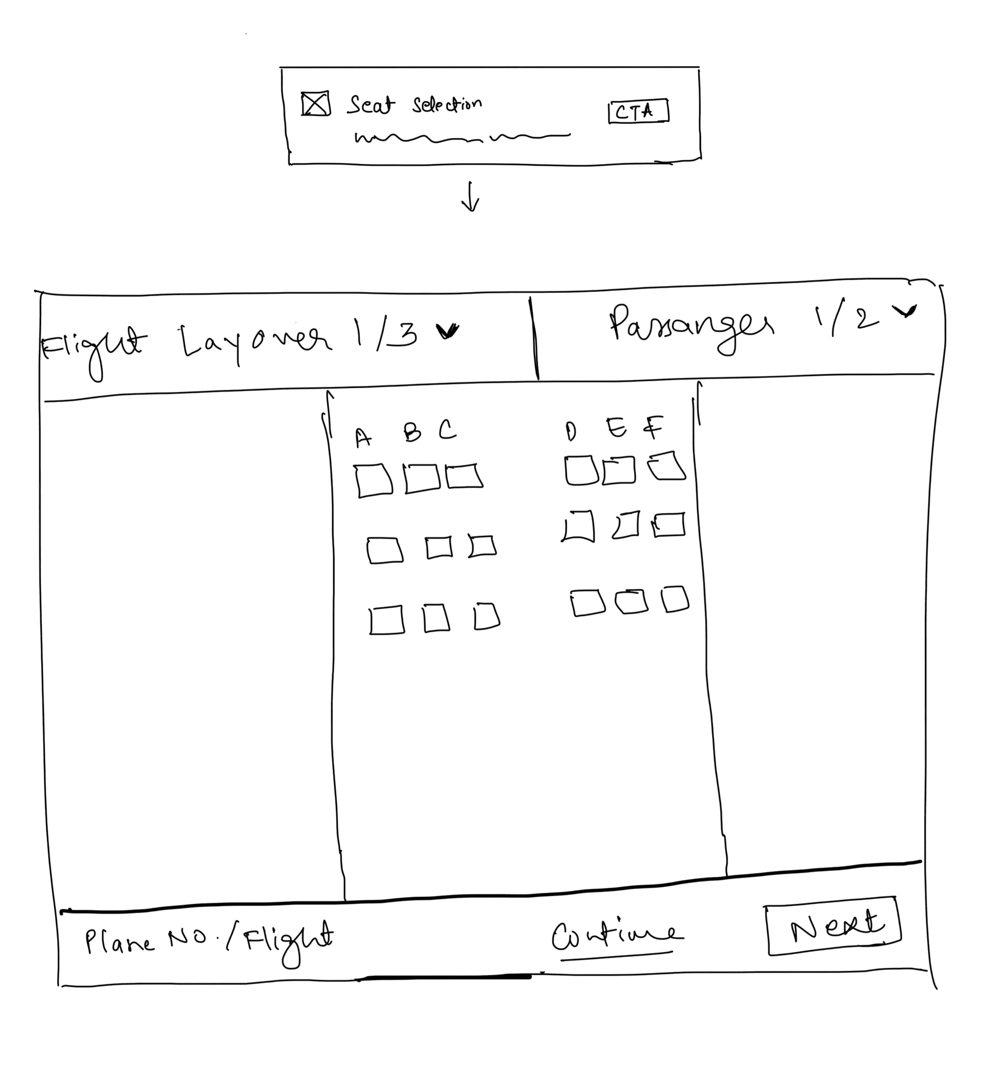
Seats
Seats
Outbound flight: Option to select a seat
Inbound flight: Option to select a seat
Total price to be paid
Outbound flight: Option to select a seat
Inbound flight: Option to select a seat
Total price to be paid
Outbound flight:Select a seat
Inbound flight: Select a seat
Total price to be paid
Outbound flight:Select a seat
Inbound flight: Select a seat
Total price to be paid
Involving the developers
Involving the developers
Involving the developers
Involving the developers
We consulted with the developers to understand the technical feasibility and approach for implementing our ideas. This is when the Gordian API came into play.
Gordian API is a powerful tool that enables the travel industry to sell flight add-ons, such as additional baggage and premium seat selection. The developers proposed integrating Gordian's airline seat map solution into the backend. This integration would allow us to offer customers a more seamless purchasing experience through our app.
Once we had a clear understanding of the technical aspects involved in implementing the add-ons, we transitioned to the design phase.
Building mockups
Building mockups
Building mockups
Building mockups
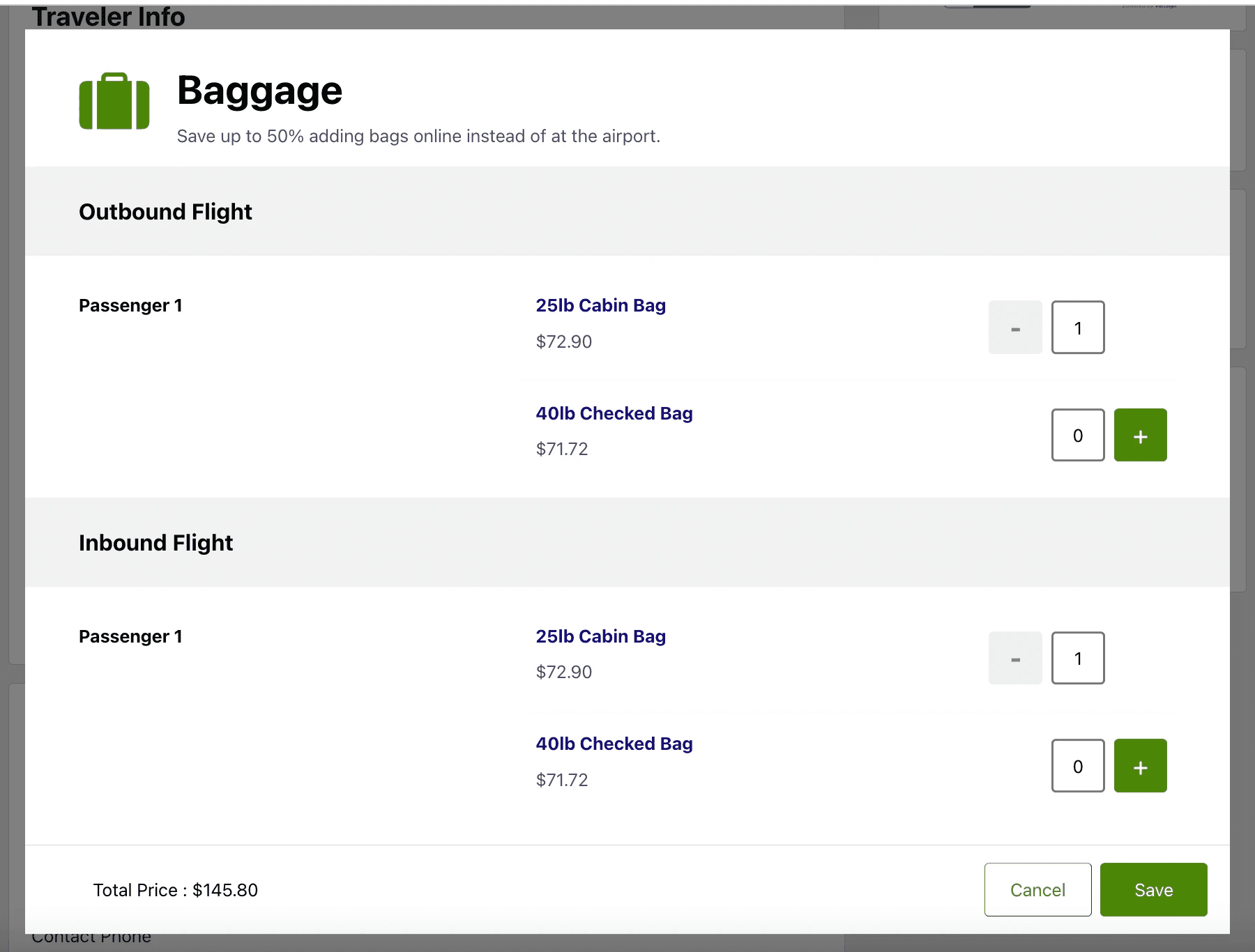
Transitioning from sketches to mockups, our design journey underwent multiple iterations. These final mockups, a blend of our initial sketches with the StudentUniverse design system and Gordian API, represent the culmination of our efforts. Here are the conclusive screenshots of our envisioned solution.
Transitioning from sketches to mockups, our design journey underwent multiple iterations. These final mockups, a blend of our initial sketches with the StudentUniverse design system and Gordian API, represent the culmination of our efforts. Here are the conclusive screenshots of our envisioned solution.
Transitioning from sketches to mockups, our design journey underwent multiple iterations. These final mockups, a blend of our initial sketches with the StudentUniverse design system and Gordian API, represent the culmination of our efforts. Here are the conclusive screenshots of our envisioned solution.
Transitioning from sketches to mockups, our design journey underwent multiple iterations. These final mockups, a blend of our initial sketches with the StudentUniverse design system and Gordian API, represent the culmination of our efforts. Here are the conclusive screenshots of our envisioned solution.


Baggage
Baggage
Baggage
Baggage
Users can select a cabin bag and 1st checked bag from our website
Users can select a cabin bag and 1st checked bag from our website
Users can select a cabin bag and 1st checked bag from our website
Users can select a cabin bag and 1st checked bag from our website
Seats
Seats
Seats
Seats
Users can select different seats for different layovers
Users can select different seats for different layovers
Users can select different seats for different layovers
Users can select different seats for different layovers


How did it work? — The Rollout
How did it work? — The Rollout
How did it work? — The Rollout
How did it work? — The Rollout
We conducted an A/B testing experiment to release the product add-ons. The results showed significant user engagement:
Over 65% of users interacted with the add-ons
37% of users added add-ons to the cart
These interactions led to a remarkable 15% increase in profits per purchase compared to transactions without any add-ons.
These findings confirmed the effectiveness of integrating add-ons into the website, validating our hypothesis.
Learnings, Challenges, Takeaways…
Learnings, Challenges, Takeaways…
Learnings, Challenges, Takeaways…
Learnings, Challenges, Takeaways…
My time at StudentUniverse provided valuable opportunities to present projects to various stakeholders, including the design team and executives. This experience was instrumental in refining my presentation and communication skills.
This project, my first significant endeavor as an intern, was particularly impactful. It challenged me to articulate my work clearly, respond to questions, and incorporate feedback based on well-founded reasoning derived from research and testing. Managing diverse feedback and fostering consensus proved to be challenging but immensely rewarding.
The success of this project underscored the significance of simple and intuitive design coupled with data-driven decision-making. It served as a testament to the transformative impact of a well-executed design process on business outcomes. Witnessing the tangible results of our efforts, manifested in increased profits and enhanced user convenience, was immensely gratifying.
