

CONTEXT
StudentUniverse is a travel and hotel booking platform offering discounted flights, hotels, and tours for students, educators, and youth.
Problem
However, one key frustration was that users often found the booking experience incomplete, because StudentUniverse didn't offer seat selection or baggage add-ons during flight bookings. This absence frustrated customers, leading to drop-offs and missed upsell opportunities for the platform.
Outcome
By introducing seat and baggage options during the checkout process, we streamlined the booking experience, resulting in a 15% increase in average order value (AOV).
Tools
Figma, FigJam and Notion
Contributors
1 Product Manager,
2 Software Developers, and
1 Product Designer (Me)
GETTING TO KNOW OUR AUDIENCE
Ever found a cheap flight, only to get hit with surprise fees at the airport?
While helping the Marketing team promote StudentUniverse outside universities in Boston, our team chatted with 80+ young travelers about their familiarity with StudentUniverse and their experiences.
What we discovered

Many students were price-sensitive but were caught off guard by baggage fees at the airport.
Others wanted to sit together when traveling in groups but had no easy way to select seats upfront.

Most travelers didn’t realize they had to book seats and bags separately via the airlines—leading to last-minute stress at check-in.
These insights hinted at the need to integrate seat and baggage selection directly into the checkout process to improve transparency and ease.
How might we
help young travellers, and provide an all-in-one solution on SU, allowing them to focus on their trip rather than logistics?
ANALYZING THE MARKET
Our competitive analysis revealed a saturated market with many platforms providing similar features
As a travel booking platform in a highly competitive e-commerce domain, we knew we had to keep an eye on industry leaders. Looking at the popular players within the space, we discovered a similar feature offering across other travel platforms like:
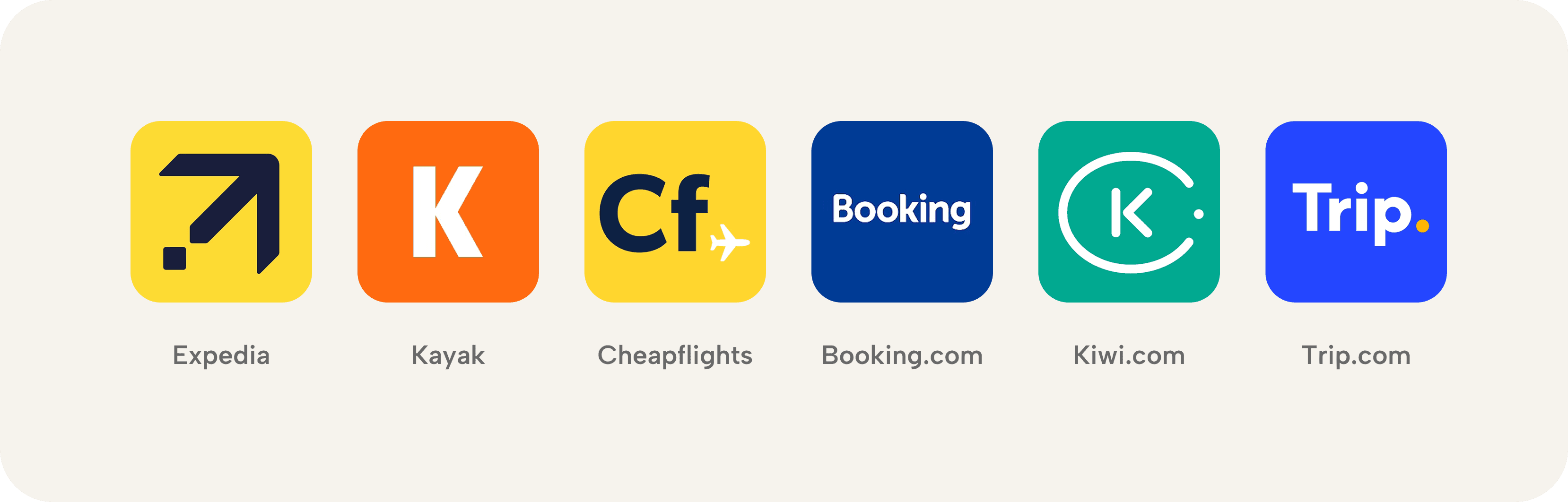
We targeted competitive analysis primarily to see:
○ features and benefits that they offer
○ understanding of their pricing strategy
○ user flow and experiences
WHAT WE LEARNED FROM THE COMPETITION
How leading travel platforms handle seats and baggage?
01
Hierarchy and Navigation
📌 Placement:
Most competitors placed seat and baggage selection after traveler details, ensuring users completed essential booking steps first.
🔀 Flow:
This made add-ons feel like an optional but convenient enhancement rather than an extra burden.
02
Layout, Typography, and Structure
.🧳 Baggage:
Competitors divided baggage options into outbound and inbound selections within the same card, allowing users to customize for each leg of their journey.
💺 Seats:
Seat selection was displayed per layover segment, mirroring how users think about their journey and reducing cognitive overload.
03
Pricing Strategy
📈 Competitor platforms marked up baggage prices by 12-20% compared to airline fees.
⚖️ A similar markup strategy was applied to seat selection, ensuring platforms captured additional revenue while staying competitive.
DEFINING THE EXPERIENCE: VISUALISING THE USER FLOW
Smart Placement of Travel Extras
From our competitive analysis, it was clear that add-ons like seat selection and baggage allowance should be seamlessly integrated into the booking journey—offering value without feeling intrusive and blending in with other add-ons.
We positioned add-ons right after flight selection, passenger details, and before payment option. This ensured that users were in the right mindset to make these decisions while finalizing their trip details.
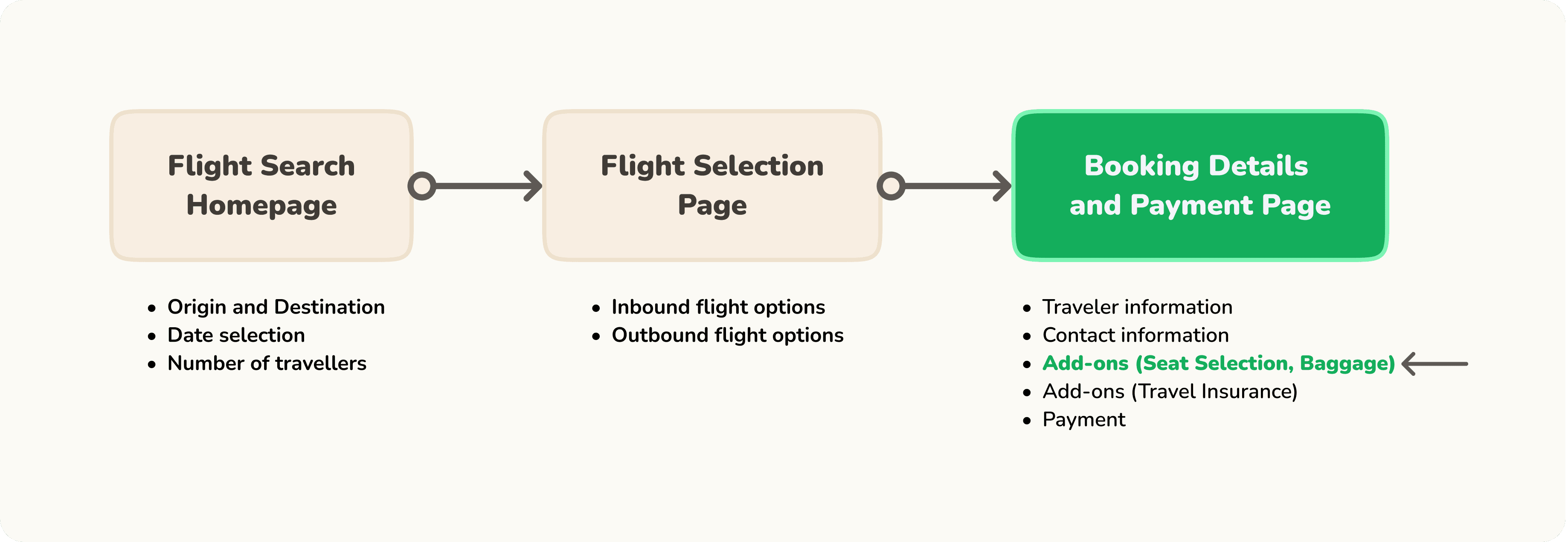
By embedding add-ons at this stage, we set the foundation for our A/B testing phase, where we refined their exact presentation and interaction.
WHITE-BOARDING/CONCEPTUALIZING KEY INFORMATION
Connecting the Dots: Structuring Key Booking Elements
Before jumping into designs, we started with a whiteboard session, identifying key information based on:
Competitive Analysis
How other platforms structured seat & baggage selection.
User Interviews
What travellers additionally cared about when booking flights.
Technical Constraints
What data was available from airline APIs.
With these inputs, we mapped out individual modal cards for key data points like—Passanger Name, Flight Details, Seat Type, Pricing, Availability, Weight Limits, Airline Restrictions, and more.

CRAFTING OUR INITIAL DESIGNS
Our Initial Design Concept to Set the Stage for Testing
Building on our whiteboarding insights, we developed a modal-based design for seat and baggage selection. This approach aimed to provide a focused, uncluttered experience for users making important travel decisions.
Our high-fidelity mockups incorporated StudentUniverse's brand colors and typography, ensuring consistency with the platform's aesthetic. We created a clear visual hierarchy, allowing users to quickly scan and understand the information.
This modal design served as our initial concept, setting the stage for further testing and refinement.

While our modal-based design aligned with our initial vision, internal discussions raised an important question:
Could integrating add-ons directly into the checkout flow create a more seamless experience? To explore this, we conducted an A/B test comparing our modal approach with a fully embedded alternative.
FINDING THE BEST FIT FOR ADD-ON SELECTION
A/B Testing Modals vs. Embedded Add-Ons: What Works Best for Users?
To compare how users interacted with each approach, we ran an A/B test measuring ease of selection, decision-making, and overall booking flow.
Variation A: Inline Add-On Cards with Modals
📌 Users clicked "Select Seats" and "Add Baggage" buttons, opening modals for selection.
🔹 Created a focused, distraction-free selection process.
⚠️ Required switching between the modal and checkout page.
Variation B: Fully Embedded Add-Ons
📌 All seat and baggage options were displayed inline after entering passenger details.
🔹 Allowed at-a-glance comparison of add-ons.
⚠️ Required more scrolling but offered a smoother flow.
Why Variation A Was the Preferred Choice:
⏰ Timing Matters → Users preferred making add-on decisions after entering passenger details, as it felt like a natural step in the process.
🎯 Focus vs. Context → Variation (A) provided a focused, distraction-free selection process, allowing users to make decisions without being overwhelmed by too much information at once.
🙌 User Autonomy → Variation (A) allowed users to interact with the add-on options in a more controlled manner, offering a clean, clear view of each choice, leading to better decision-making.
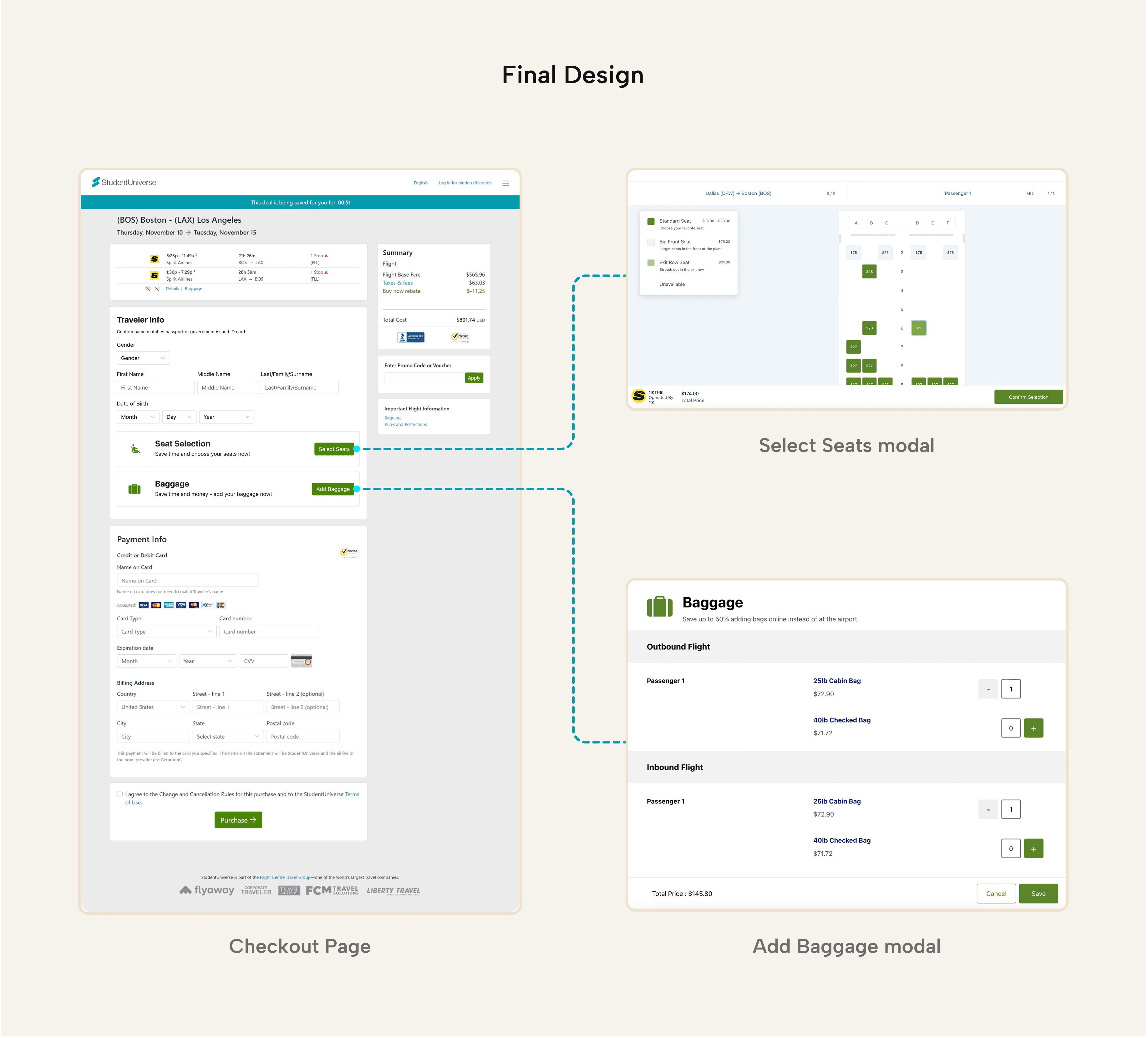
FINAL PRODUCT ADD-ONS
What We Rolled Out
After testing, we moved forward with the modal-based approach (Variation A), ensuring a smooth and distraction-free selection process.
We worked closely with the development team to implement:
✅ A clean, focused modal experience
⚠️ Edge cases
💰 Real-time pricing updates for transparency
Here’s a look at the final implemented design in action:
Baggage
Users click 'Add baggage' button, select bags, and then click 'Save.' The total amount is shown on the right.
Seats
Users click 'Add baggage' button, select bags, and then click 'Save.' The total amount is shown on the right.
Outcome of the New
Feature Implementation
The introduction of seat and baggage selection directly contributed to a 15% increase in Average Order Value (AOV), which refers to the average amount a customer spends per booking.

PROJECT TAKEAWAYS
Reflections on Growth and Impact
This project reinforced how small design changes can make a big difference. By listening to users and understanding their frustrations, we were able to create a smoother, more transparent booking experience.
It was also a good reminder that the right timing and placement matter just as much as the features themselves. Seeing the impact—both in numbers and in user feedback—made all the iterations worth it.